Juristat’s Examiner Reports have been totally redesigned to give you the information you want, faster than ever. All charts are now easier to read and include help text to answer any questions you have (just click the “i” icon in the upper right hand corner of each graph or section). We’ve also added intuitive search functionality to our rejections, appeals, and applications tables. Finally, in addition to overhauling our filtering system to include more options, we’ve added some new graphs, brought back old favorites, and improved printing. Read on to find out more.
Quick Search Bar
You can now jump to a different Examiner Report without leaving the report you’re on. Our new unified search box is consistent across all our products and makes navigating between reports much easier.

Filters
We’re excited to offer a dramatically improved filtering experience. You can now filter by class, assignee, firm, and exclude continuations and foreign priority. We even added an entity status filter. All graphs and tables respond to the filters, and – one of the most exciting features – after you’ve applied the filters you want, you can bookmark the report and always return right to that view. That means you don’t have to re-apply the filters every time. And If your colleague also has a Juristat login, you can copy and paste the link and they’ll go directly to the view of the report you just created.

Examiner Overview
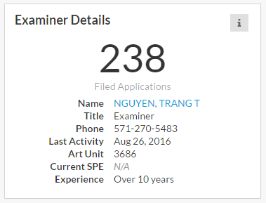
We made the most sweeping changes in what used to be called the Examiner Overview section. The examiner data is now easier to digest and gives you more relevant information. The examiner’s experience is more prominent, making it easy to see years of experience, contact information, and total applications.

Applications by Disposition/Filing Year
The applications over time graph has a new format, and defaults to disposition year, so you can get a clear picture of the examiners disposition breakdown at a glance. When you hover over a given year, tooltips provide more detail:

As before, you can toggle the graph to filing year, which shows you a breakdown of the examiner’s history by filing year:

Office Action Response Win Rates
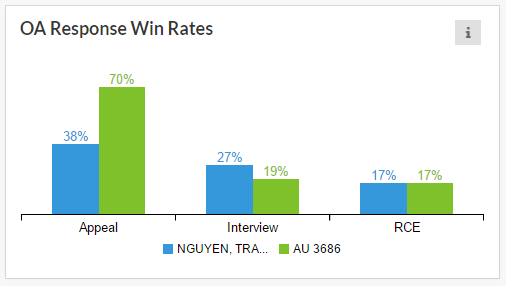
We removed the Best OA Path donut. While customers liked the appearance of the graph, we found through customer interviews that it was pretty hard to understand. The new OA Response Win Rates graph makes things much clearer by showing the applicant’s average allowance rate against an examiner. The graph also provides the art unit averages.

Disposition by Rejection Count
This is a brand new visualization that shows a breakdown of disposition after a given number of office actions. Again, tooltips offer more detail when hovering over a rejection count. This is a great one to show clients to engender confidence after a rejection. Pro tip: use the assignee filter at the top of the report to highlight to clients that their competitors are facing a similar prosecution profile.

Return of the CIP Tool
As you may remember, we used to offer a standalone tool that analyzed the effects of filing a continuation or CIP. Well, we’ve heard our customers and decided to bring them back. However, instead of simply re-launching the old tool, we integrated it directly into our Examiner Reports to provide greater context. The charts show the probability of getting a new examiner or art unit after filing a continuation or continuation-in-part.

Tables: Rejections, Appeals, and Applications
We’ve improved all our tables by making all columns sortable, adding a comma-separated text search, and limiting the number of rows displayed. Gone are the days of scrolling for eternity to find what you need. We also now hyperlink applications to their page in the USPTO full text and image database, so you can easily get to an app. It’s the little things.
Rejections
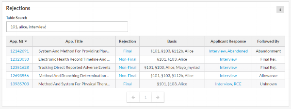
The rejections section remains the same except for the new intuitive comma-separated text search. So now you can type things like “101, alice, rce” and the table will only show you §101 Alice rejections where the applicant’s response was an RCE.

We’ve also added links to the actual PDF of an applicant’s response to a rejection. So if an applicant responded with an amendment, we link to the PDF of the claims document.
Appeals
We’ve made large improvements to our document detection and eradicated the confusing multiple PDF links from the old appeals table.
 That's pretty neat!
Applications
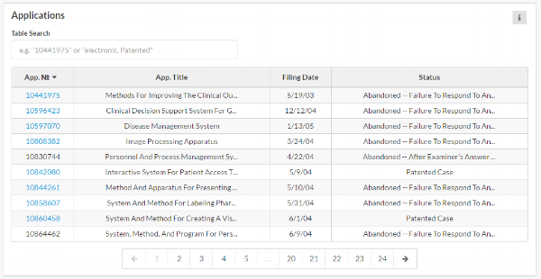
The applications table is now much more user-friendly with the text search box making it easier to filter down to the application you’re looking for. It features the same comma-separated values as the other tables, as well as sortable columns, and the hyperlinks to the USPTO full text and image database.

If you're already a Juristat customer, I hope you'll log in and take it for a spin. If you're not, sign up today and see what Juristat can show you.